branding. Packaging. WEB DESIGN.
Creating a supplement branding that feels as calming as the product itself.
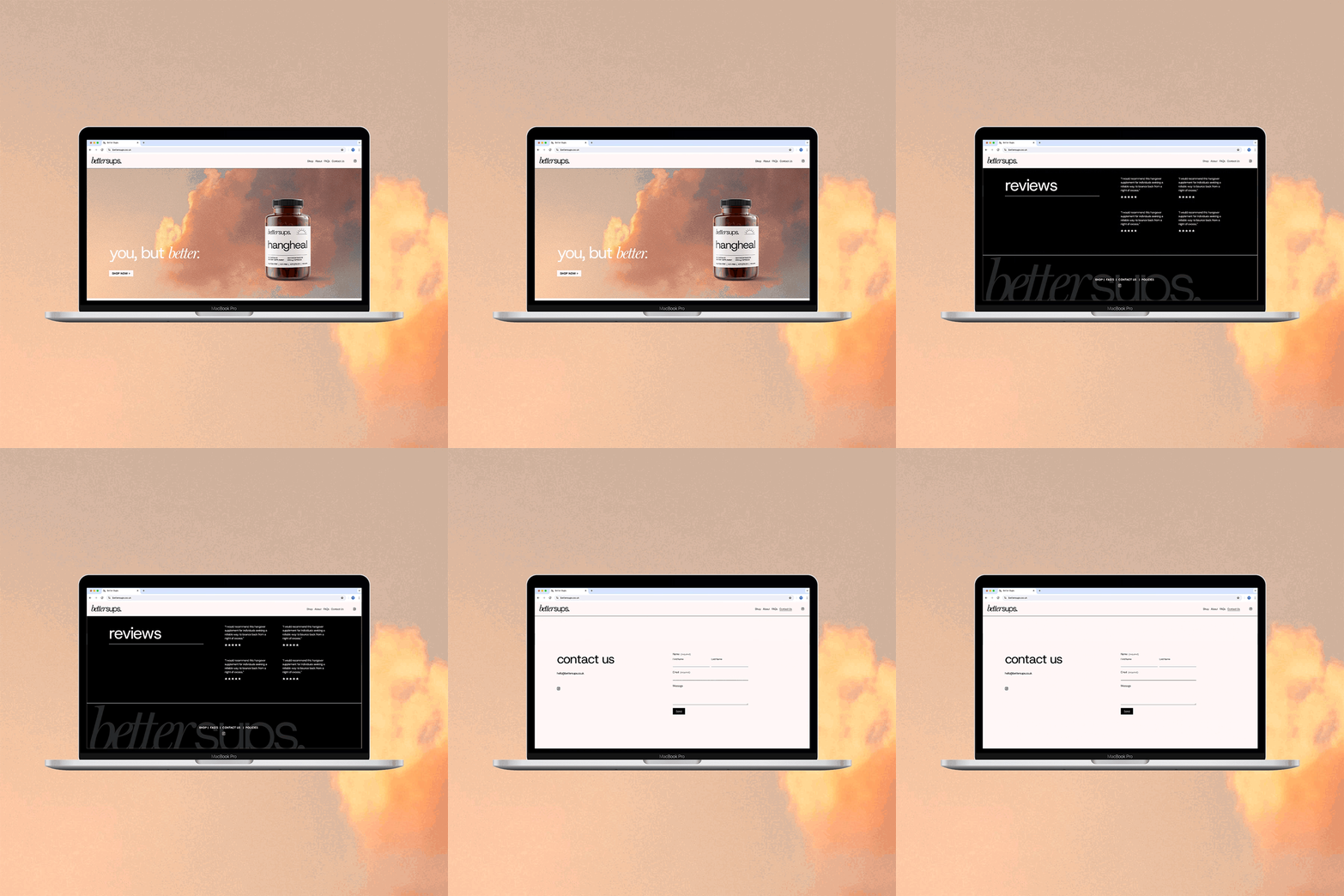
BetterSups creates products that enable you to feel at your best; from hangover cures to easing joint pain. The brief was to create a premium identity that is as calming as taking the supplement, and with high quality at its core. This lead to a muted and warm colour pallet, clean typography and brand imagery that feels like a morning hug.
The contemporary word mark adds emphasis on the benefits of the brand - you can hear someone saying it as you read. It also allows for sub-brands to be created easily and pairing it with clean typography creates a look reflective of the quality of the product.


